Cash Flow Dashboard Example For Mastering Your Finances

Research from Deloitte indicates that organisations that embrace data-driven decision-making have a 17% higher chance of outshining their competitors. Intriguing, right? Wonder how to achieve that?
One of the ways is creating a cash flow dashboard, as it provides the data you need to make informed decisions and drive your business forward.
In this article, we will look at cash flow dashboard examples and suggest the 10 most important metrics you can include in your cash flow dashboard for successful tracking of your business KPIs.
What will you gain as a result? You’ll learn how to create a powerful cash flow dashboard.
Change the way you work with agentic AI
One-click dashboards,KPI tracking, and AI-powered insights—for work that actually gets done.

Table of Contents:
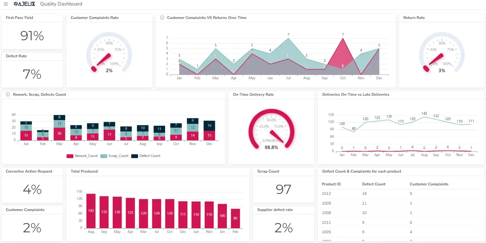
What is a cash flow dashboard?
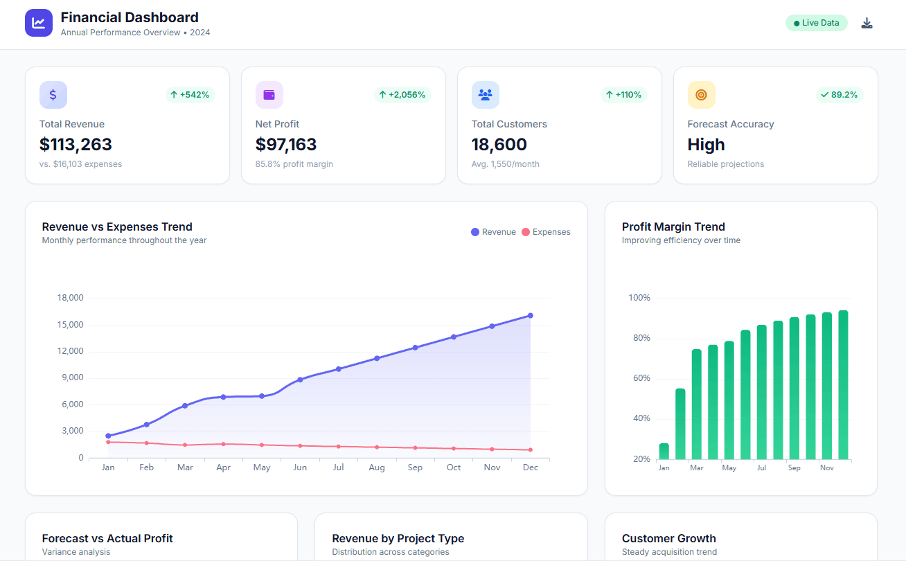
A cash flow dashboard is a visual tool that provides a real-time overview of a business’s cash inflows and outflows. It typically includes key metrics such as:
- Cash balance: The current amount of cash available.
- Cash inflows: Sources of income, such as sales, investments, and loans.
- Cash outflows: Expenses, such as payroll, rent, and purchases.
- Forecasted cash flow: Projections of future cash inflows and outflows.
Cash flow dashboards can be customized to meet the specific needs of a business, but they generally aim to help businesses:
- Identify potential cash flow problems early.
- Make informed decisions about spending and investment.
- Improve cash flow management.
- Track progress towards financial goals.
By providing a clear and concise view of a business’s financial health, cash flow dashboards can be a valuable tool for improving overall performance. Using tools that streamline payroll processes, such as generating paystubs, further enhances cash flow management by ensuring precise tracking of payroll expenses.
For all the video lovers here, we’ve created a dashboard creation guide.
How to Create a Dashboard in Ajelix BI Platform:
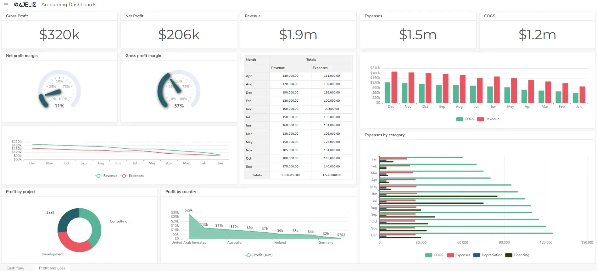
10 Key Metrics for a Cash Flow Dashboard
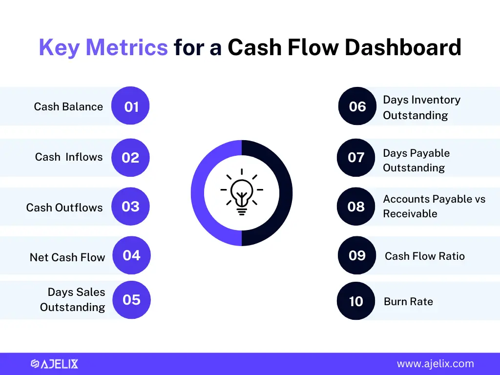
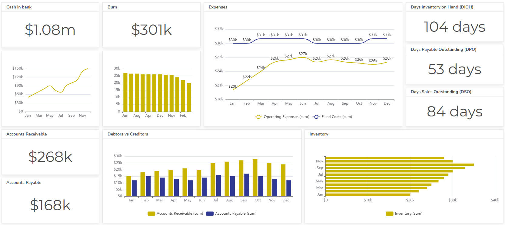
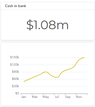
1. Cash balance
The current amount of cash available. This is the most fundamental metric, representing the amount of cash readily available in the business’s bank accounts.
2. Cash inflows
Sources of income, such as sales, investments, and loans. Cash Inflows are the sources of income that contribute to the business’s cash balance. They can include:
- Loan proceeds
- Sales revenue
- Interest income
- Investment income
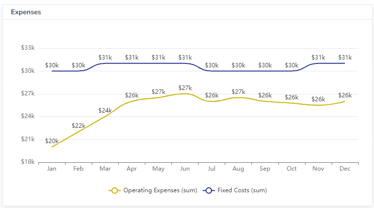
3. cash outflows
Expenses, such as payroll, rent, and purchases. Cash Outflows are the expenses that reduce the business’s cash balance. They can include:
- Loan repayments
- Payroll
- Rent
- Utilities
- Purchases
4. Net Cash Flow
This is the difference between cash inflows and cash outflows.
5. Days Sales Outstanding (DSO)
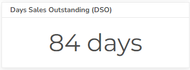
This metric measures the average number of days it takes for a business to collect payment from customers.
Formula: DSO = (Accounts Receivable / Net Credit Sales) * 365
6. Days Inventory Outstanding (DIO)
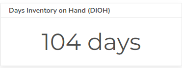
This metric measures the average number of days it takes for a business to sell its inventory.
Formula: DIO = (Average Inventory / Cost of Goods Sold) * 365
Struggling with manual calculations & tiring setups?
Let agentic AI do the heavy lifting.
Start free
Fast sign up & easy setup
7. Days Payable Outstanding (DPO)
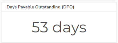
This metric measures the average number of days it takes for a business to pay its suppliers.
Formula: DPO = (Accounts Payable / Cost of Goods Sold) * 365
8. Accounts receivable vs payable
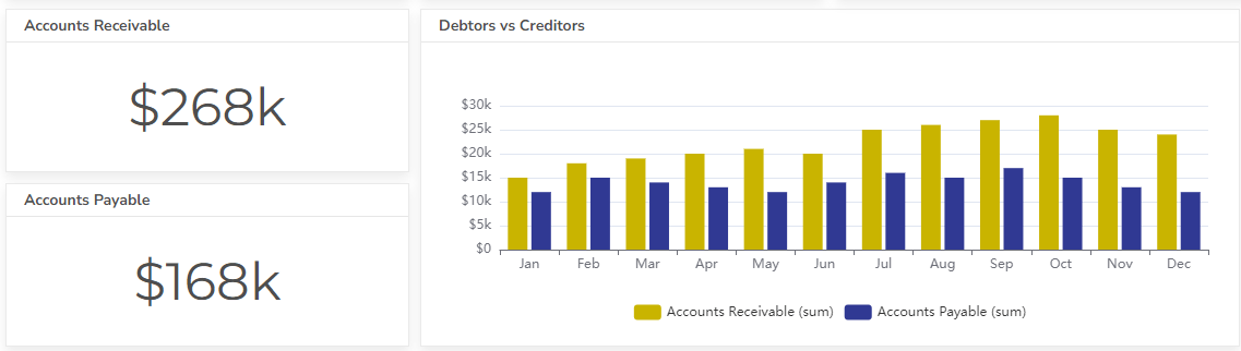
A comparison of the amount owed to the business by customers (accounts receivable) versus the amount owed by the business to suppliers (accounts payable).
9. Cash Flow Ratio
This ratio measures a business’s ability to meet its short-term obligations.
Formula: Cash Flow Ratio = Cash Flow from Operating Activities / Current Liabilities
10. Burn Rate
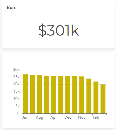
This metric is particularly relevant for startups and businesses that are not yet profitable. It measures the rate at which a business is spending cash, often calculated on a monthly basis.
A high burn rate can indicate that a business is at risk of running out of cash if it does not generate sufficient revenue or reduce its expenses.
Formula: Burn Rate = Total Monthly Expenses – Total Monthly Revenue
Conclusion
In today’s fast-paced business world, staying on top of your finances isn’t just important—it’s essential. A cash flow dashboard empowers you with real-time insights, helping you track key metrics, like cash inflows, outflows, and net cash flow. Data-driven decision-making can help you spot potential cash flow issues early, optimize spending, and outshine your competitors.
The best part? With the right cash flow dashboard, you’re not just crunching numbers—you’re gaining the clarity and confidence to drive your business forward.
Intrigued to learn more? Check out our resourceful blog page.
Want to stay in the deep research and tricks loop? Sure, let’s stay connected.
FAQ
A cash flow dashboard is a visual tool that provides a real-time overview of a business’s financial health by tracking key cash flow metrics such as cash balance, inflows, outflows, and net cash flow. It helps businesses monitor financial trends, anticipate cash shortages, and make informed decisions.
While a cash flow dashboard primarily helps in managing cash flow, it can indirectly improve profitability by enabling better financial decisions. Understanding your cash position allows you to optimize expenses, reduce unnecessary costs, and allocate resources more efficiently.
Absolutely! Small businesses, startups, and large enterprises alike can benefit from a cash flow dashboard. For small businesses, it helps maintain financial stability, avoid cash shortages, and plan for growth effectively.
A cash flow dashboard should include key metrics like cash balance, cash inflows, cash outflows, net cash flow, DSO, DIO, DPO, burn rate, and the cash flow ratio to monitor financial health effectively.
Explore other dashboards


Ready to create your dashboard?