Exploring Data Visualization Examples, Benefits & Importance

Have you ever struggled to make sense of endless numbers? That’s where data visualization comes in. And no, it’s not just about charts—it’s about turning raw data into a story we all can understand.
In this article, we will start by analyzing the data visualization definition and its importance, and then quickly move to the best data visualization examples.
Data Visualization Definition
Let’s start by answering the question: What is Data Visualization?
Cambridge Dictionary says that data visualization is the act of representing information as a picture, diagram, or chart, or a picture that represents information in this way.
Well. Good but too long.
We have made a 3-word short data visualization definition: graphical representation of data. C’mon, let’s not count the word “of”.
Data Visualization usually uses charts, graphs, and other visual elements to convey information. The goal is to make data more accessible and easier for individuals to grasp and work with.
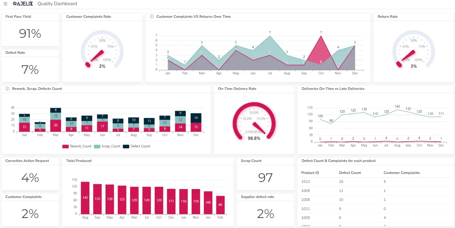
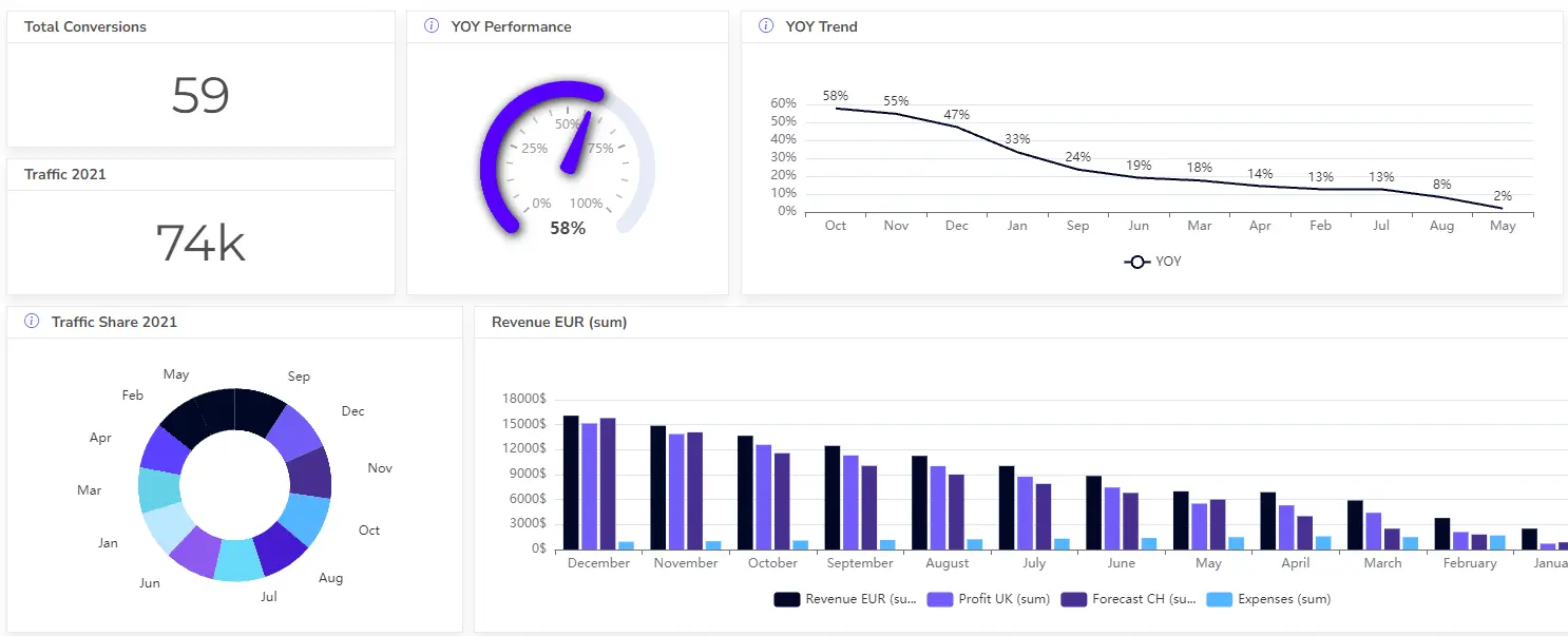
Here is a Data Visualization Example:
You might be interested: Data visualization principles and best practices
What Are the Benefits of Data Visualization?
The significance of data visualization is undeniable. It’s not just about making data look pretty, it’s about making it meaningful. By visually representing data, we gain a deeper understanding of it.
Here are some of the main benefits:
| Benefit | Description |
|---|---|
| Simplified Complexity | Turns raw data into clear visuals for easier understanding. |
| Revealing of Patterns & Trends | Helps identify hidden trends, correlations, and outliers in data. |
| Evidence-Based Actions | Supports faster and more accurate decisions with clear data visualization. |
| Improved Communication & Engagement | Makes data more engaging and memorable, resulting in better communication. |
| Increased Accessibility | Allows people from all backgrounds to understand and interact with data. |
Importance of data visualization
Data visualization is crucial because it bridges the gap between raw data and human understanding.
Here are 3 arguments for why data visualization is so important:
1. Improved Understanding of Data
Data visualization is a critical tool for turning raw data into clear insights.
It helps spot patterns, trends, and connections in complex data—like shining a light on hidden insights. For example, a company might use a chart to see sales trends over time, helping them understand when sales are high or low and why that might be happening. This makes it easier to see what’s going on with the data.
2. Data-Driven Decision Making
Data visualization leads to evidence-based decision-making. This clarity helps businesses identify trends, risks, and opportunities that might not be obvious in raw data.
For example, a manager could use a graph to compare sales performance across different regions, quickly spotting which areas are thriving and which need attention. This helps the decisions to be grounded in actual data, leading to more effective and targeted actions.
3. Effective Collaboration
Data visualization helps simplify the communication of technical data, making it accessible to a wider audience. Transforming complex concepts and statistical terms into easy-to-understand visuals, such as charts, graphs, and maps, allows people from different fields to better understand and collaborate.
For instance, a business might use a pie chart to show the breakdown of its annual expenses, making it easy for non-financial staff to understand key spending areas.
Chart Types in Data Visualization
Data Visualization is based on a broad variety of charts, such as bar charts, line charts, pie charts, or scatter plots – each has a specific purpose and is suitable for different types of data. Exploring these types is the first step in mastering data visualization.
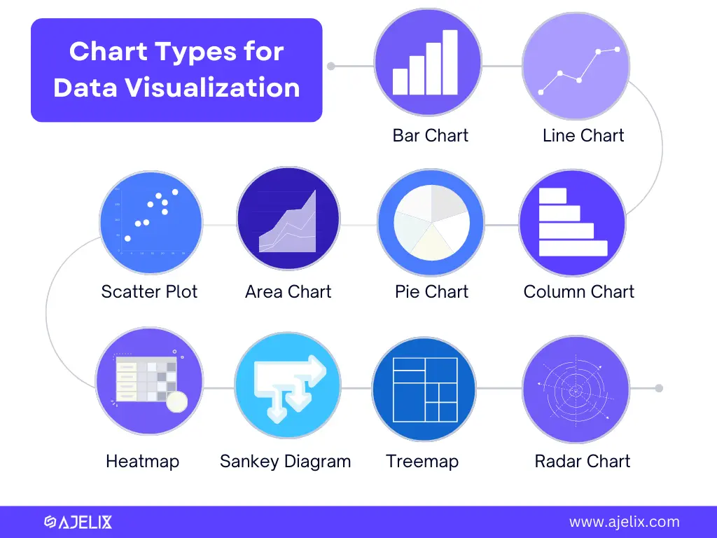
Here are the chart types & their use:
| Chart Type | Use |
|---|---|
| Bar Charts | For comparing different categories of data, such as sales figures by region or products |
| Line and Area Charts | For tracking trends over time, for example, stock prices or temperature fluctuations. |
| Pie Charts | For visual representation of parts within a whole, making them ideal for showing market share or budget allocation |
| Scatter Plots | For revealing relationships between variables, helping identify correlations and outliers. |
| Heatmaps | For visualizing density and patterns, often used in fields like epidemiology and user behavior analysis |
| Sankey Diagrams | For displaying flow and quantity relationships, making them important for visualizing processes and resource allocation |
| Treemaps | For visualizing hierarchical data, showing the relationships between entities and sub-entities. |
| Radar Charts | For comparing multiple variables across a common axis |
Data Visualization Tools
There is a broad variety of data visualization tools, from free open-source options to advanced commercial software. Choosing the right one depends on three aspects: your budget, customization needs, and project complexity.
Open-source tools offer flexibility but require technical expertise, while commercial software provides user-friendly interfaces and advanced features.
It’s still quite common to use good old Excel for data visualization but Excel has limitations with large datasets and complex analysis. For more advanced needs, many alternatives offer greater scalability and customization.
Among them are data visualization tools, like Ajelix BI, Tableau, or Power BI. We have made an in-depth comparison of 14 Best Data Visualization Tools. Feel free to check it out.
3 Best Tips for Data Visualization
Effective data visualization can be described in 3 tips:
1. Simplicity
Simplicity is key. Extraneous details can distract from the core message, so it’s crucial to simplify visualizations to their essence.
2. The Right Chart Type
Selecting the right chart type is important. It depends on the data and the story you want to convey.
3. Storytelling and Context
Data visualization is not just about presenting numbers but about telling a story. Crafting a narrative engages the audience emotionally, ensuring that data is not just understood but remembered. Adding context and insights to data visualizations helps the audience understand the “why” behind the data.
Data Visualization Examples
Let’s look at 3 different examples: Sales, Marketing, and Human Resources Data Visualization Reports.
Sales and Revenue Data Visualization Example
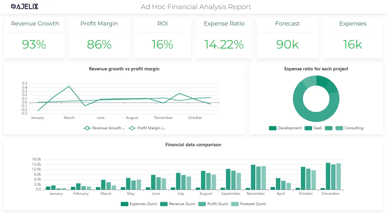
Visualizing sales and revenue data can help identify trends and areas for improvement.
Examples include sales growth over time and revenue by product category. This data helps businesses to make evidence-based decisions on their finances.
Marketing Campaign Data Visualization Example
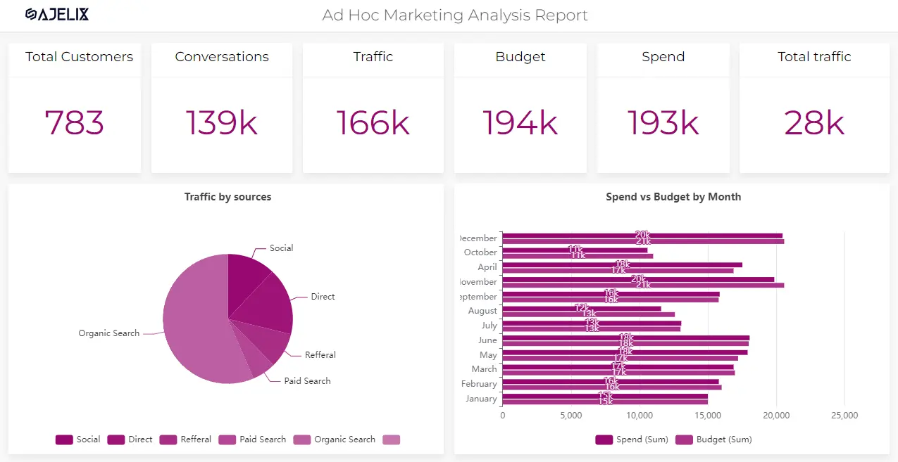
Marketing campaigns generate vast amounts of data, ranging from customer engagement metrics to conversion rates and ROI.
Visualizing this data through a reporting platform, for example, Ajelix BI can help quickly assess the effectiveness of strategies, such as social media engagement or email marketing performance.
Human Resources Data Visualization Example
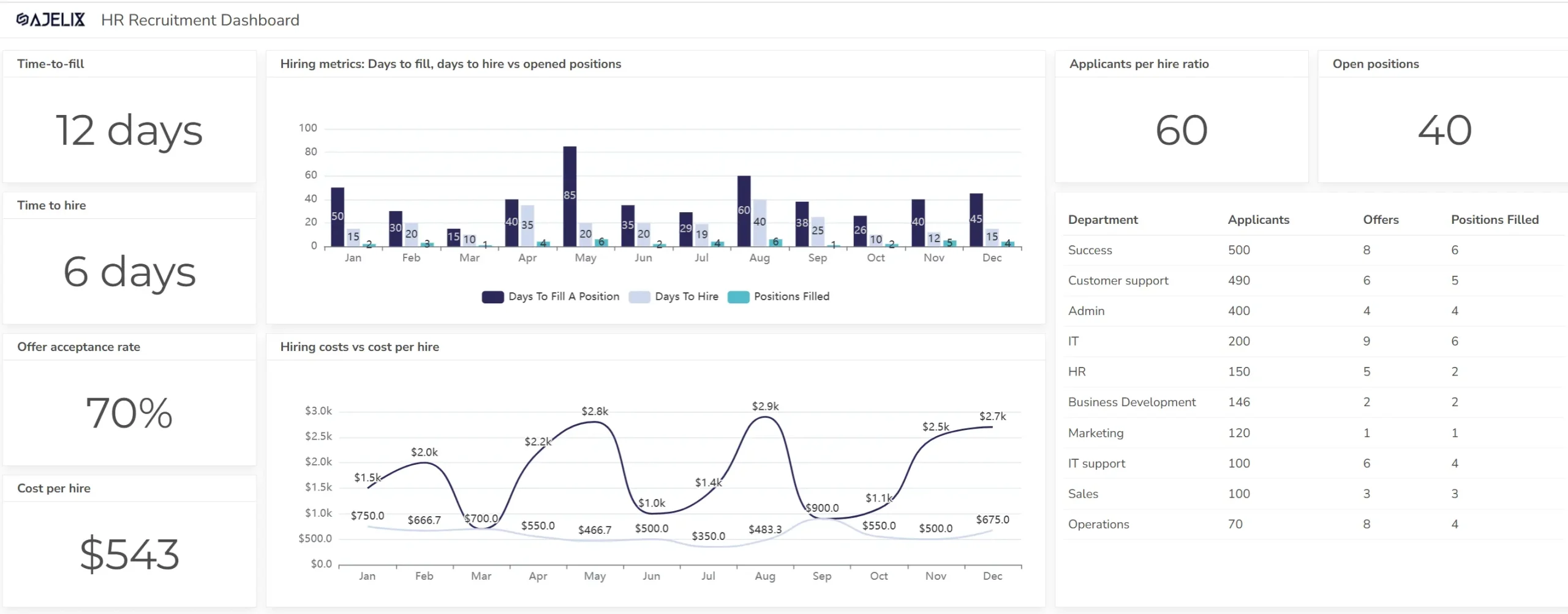
HR data visualization helps organizations track key metrics like employee performance, turnover rates, and recruitment efficiency.
For example, a report generated by an HR dashboard might highlight the success of different hiring channels, employee satisfaction trends, or the effectiveness of training programs.
Eager to learn about more data visualization examples? Check them here
How to Quickly Create a Data Report?
One of the ways how to create a quick data visualization is with Ajelix BI Platform which is made for non-techies. Data visualization is possible in a few clicks: Upload Your Data, Create a Dashboard, and Customize it.
See how easy it is to create a basic data visualization report:
Conclusion
At its core, data visualization definition is all about changing raw data into clear, visual insights. As we’ve seen through various data visualization examples, the right data visualization techniques—from bar charts to heatmaps—can make complex information easy to understand and act on.
The best part? You don’t need to be a data expert! With modern BI tools like Ajelix BI, creating powerful visualizations is simple. So why not give it a try and see how easy and impactful data visualization can be?
Has the topic of data visualization caught your interest? High Five! Our weekly blogs are all about data, technology, and AI.
Want to stay in the deep research and tricks loop? Sure, let’s stay connected.
FAQ
Data visualization is the graphical representation of data. It’s done by using charts, graphs, and other visual elements to make complex information easier to understand and analyze.
Data visualization helps simplify complex data, reveal patterns and trends, and improve decision-making, and communication by making data information more accessible to a wider non-finance audience.
Examples of data visualization include sales performance dashboards, marketing campaign analysis, HR reports on employee turnover, and financial trend charts.
Yes! There are Business intelligence (BI) tools like Ajelix BI that make it easy to create professional visualizations without coding or advanced technical knowledge.
Data visualization uses various charts, like bar and column charts for comparing categories, line charts for trends, and pie charts for parts of a whole. Scatter plots show relationships between variables, while heat maps visualize patterns and density. Each chart type serves a specific purpose based on the data.
From data to report in one minute or less with Ajelix BI