How to Make Your Google Sheets Data Look Professional

Discover other articles
- GLM-5 is Now Available on Ajelix AI Chat
- AI Spreadsheet Generator: Excel Templates With AI Agents
- Excel Financial Modeling With AI Agents (No Formulas Need!)
- AI Landing Page Generator: From 0 To Stunning Page With Agent
- Creating Charts In Excel with Agentic AI – It Does Everything!
- Create Report From Google Sheets Data with Agentic AI
- How To Create Powerpoint Presentation Using AI Agent (+Video)
- Ajelix Launches Agentic AI Chat That Executes Business Workflows, Not Just Conversation
- 7 Productivity Tools and AI Plugins for Excel
- Julius AI Alternatives: Top 5 Choices 2026
- No Code Analytics: Top Tools in 2026
- Automation Tools for Excel in 2026: Built-In & Third-Party
- 5 Healthcare Data Analytics Trends 2026
- Best Analytics Platform For Startups In 2026
- 15 Best AI Tools For Startups In 2026 We Tried
- 7 Best AI Tools for Excel Data Analysis (2026 Comparison)
- AI Data Intelligence For Workspace
- Conversational Analytics & AI
- Which AI Model Will Survive Our Test: Claude vs Perplexity?
- Will AI Replace Data Analysts?
Try AI in Google Sheets
6 minutes read
Let’s be honest—staring at a messy spreadsheet is the last thing anyone wants to do. Whether you’re managing budgets, tracking sales, or just trying to keep your data in order, well-organized and professional Google Sheets data makes all the difference.
…but how to make Google Sheets look good? Good question, for which we have good news!
We have created 10 simple tips for organizing Google Sheets data, so you can turn that cluttered mess into a professional and easy-to-read spreadsheet.
How to Make a Google Sheet?
First things first, let’s quickly revise how to make a Google Sheet.
Author’s note: Google Sheet, not Excel Spreadsheet. Oftentimes, people still confuse these platforms and that’s okay! Researcher Joseph Rosener has made a comparative analysis of both platforms and you can also also check our summary of the differences between Google Sheets and Microsoft Excel in case you still feel confused.
Anyhow, creating a Google Sheet is straightforward and super simple:
- Sign in to your Google account
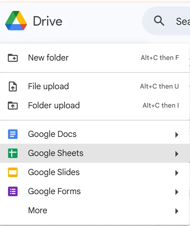
- Open Google Sheets
You can do this by opening your Google Drive, clicking on “+” and then selecting Google Sheets.
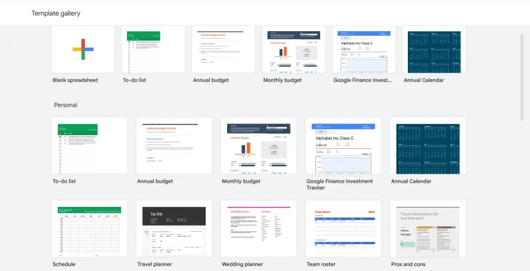
- Click on a blank spreadsheet or choose a template
Feel free to browse through the Google Sheets Templates Gallery:
Voilà – now your Google Sheet is created! You can start customizing it and sharing it with your colleagues by adding their email addresses or sending them a link.
The next step, well, actually the question, is: How to make your Google Sheets look good? This is where our ten tips come to shine.
10 Tips for Creating a Professional-looking Google Sheet
Infographic of 10 tips on how to make your Google Sheet look professional:
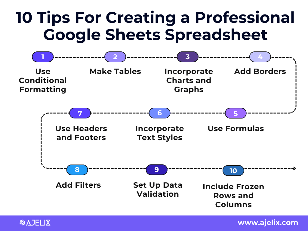
1. Use Conditional Formatting
One of the best ways to make your data stand out is by using conditional formatting. This feature allows you to highlight important information, such as values that exceed a certain threshold or cells that contain certain keywords. You can also use it to add color to your spreadsheet, making it easier to identify trends and patterns. You can use the Format > Conditional Formatting menu in Google Sheets to get started.
2. Make Tables
Tables are a great way to organize data and make it easier to read. When creating tables, make sure to use row and column headings to identify each piece of data. Additionally, you can add alternating background colors to each row to make it easier to scan the table. To create a table, you can use the Insert > Table menu in Google Sheets.
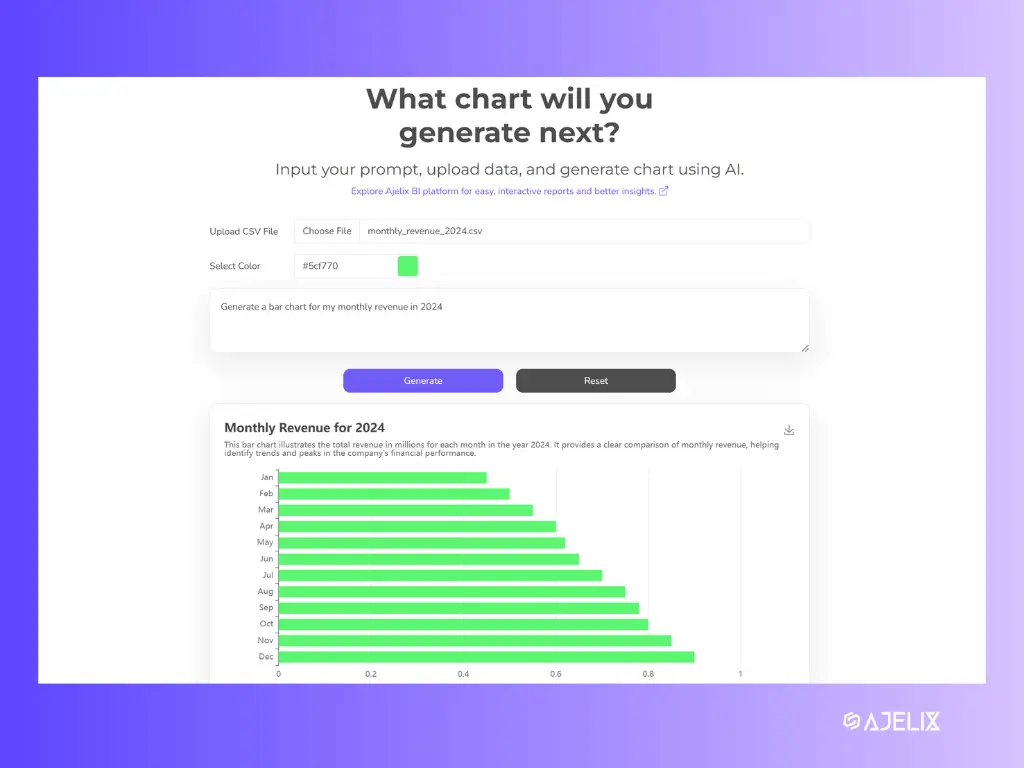
3. Incorporate Charts and Graphs
Charts and graphs are an effective way to visualize data and make it easier to understand. Google Sheets can automatically generate charts and graphs based on your data. You can use the Insert > Chart menu in Google Sheets to create a chart.
In case that doesn’t work or seems too time-consuming, try the AI Graph Generator. It doesn’t require any sing-ups and always works like a charm for us:
4. Add Borders
Adding borders to your spreadsheet can help make it look more organized and professional. You can use the Format > Borders menu in Google Sheets to apply a border to a range of cells.
5. Use Headers and Footers
Headers and footers are a great way to add additional information to your spreadsheet, such as the date, page numbers, and company logo. You can use the Insert > Header & Footer menu in Google Sheets to add a header or footer.
6. Incorporate Text Styles
Using text styles can help make your spreadsheet look more polished and professional. You can use the Format > Text Styles menu in Google Sheets to change the font, size, color, and other formatting options.
7. Use Formulas in your Google Sheets Data
Formulas are a great way to automate certain tasks in Google Sheets. For example, you can use formulas to calculate sums, averages, and other values. You can use the Insert > Formula menu in Google Sheets to start using formulas.
In case formulas are not your best friends, try the Google Sheets formula generator. (No sign-up required woop woop!)
See this AI tool in action:
8. Add Filters to your Google Sheets Data
Filters are a powerful way to quickly sort and analyze your data. You can use the Data > Filter menu in Google Sheets to add filters to your spreadsheet.
9. Set up Data Validation
Data validation is a great way to ensure that your data is accurate. You can use the Data > Data Validation menu in Google Sheets to set up rules for data entry.
One of the best data validation options is creating a dropdown list. See how to do it here:
10. Include Frozen Rows and Columns
Frozen rows and columns are a great way to keep certain data visible at all times. You can use the View > Freeze menu in Google Sheets to freeze rows and columns.
Conclusion
Congrats, you’re now on your way to becoming a Google Sheets pro! You now have earned valuable tips to keep your Google Sheets data professional and well-organized. Whether you’re using it for work or personal projects, these tips will make your life easier.
Remember the mantra? Work smart, not hard! So, consider integrating AI into your Google Sheets, like AI Formula Generator which generates formulas for you, and AI Formula Explainer which explains them, improving your formula learning tempo.
Want to stay in the tips and tricks loop? Sure, let’s stay connected.
FAQ
To make your Google Sheets data look more professional, use conditional formatting for highlighting important data, create structured tables, incorporate charts and graphs, and apply borders for better readability. Don’t forget to use consistent text styles and headers for a clean look.
Start by using filters to quickly sort through data, freeze rows and columns to keep key information visible, and structure your sheet with headers and footers. For large datasets, consider using a Google Sheets data table for better organization.
To create an automatic formula in Google Sheets, you can use the built-in function ARRAYFORMULA to apply calculations across multiple rows automatically. Additionally, AI tools can be helpful. Consider using AI Google Sheets Formula Generator to generate formulas instantly, saving you time and effort.
Use conditional formatting, tables, borders, charts, and custom text styles to enhance readability and professionalism.
