KPIs are metrics that help businesses track their progress toward achieving specific goals. They provide valuable insights into how well a company is performing and where improvements can be made.
Metrics can be created using our data preparation tool before visualization. This guide will walk you through the steps to create a calculated field. For more detailed data modeling guides visit this guide.
If you prefer, here’s the video guide 👇 if not, continue scrolling and follow the written steps
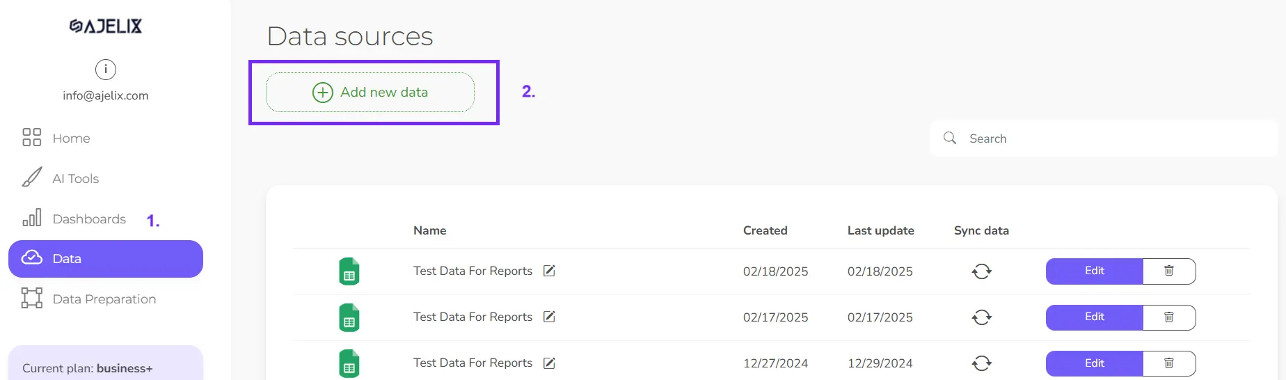
1. Connect Data Source
The first step is to add the data source. If you already have the data source, then skip this step. If you don’t have a data source follow the guides here to upload your data source.
2. Clean and transform your data
Ajelix BI offers a data preparation tool for your data where you can transform your data, filter values, and calculate metrics. This ensures accuracy and consistency. It’s not a mandatory step, but it is recommended if you need more advanced analytics and your uploaded data needs modifications.
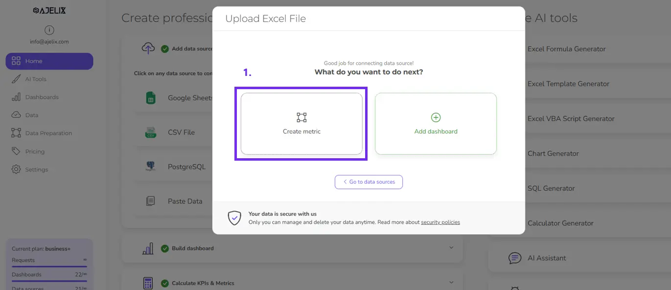
To do that open data preparation tool after you have successful uploaded data or click on “Data preparation” on the left menu.
3. Create calculated fields
In the data prep tool, you can create different KPIs and metrics to transform your data. To create a KPI follow these steps (and check the image for better understanding):
- Open the data source you want to edit
- Click “Calculate metric”
- Rename the metric, e.g., “ROI”
- Insert the calculation in the formula bar. Here, you can write Excel-like functions, SQL queries (we have an SQL query generator that can help you write these functions), or simple calculations such as summing or dividing different columns.
- Click “Calculate” to get the measure
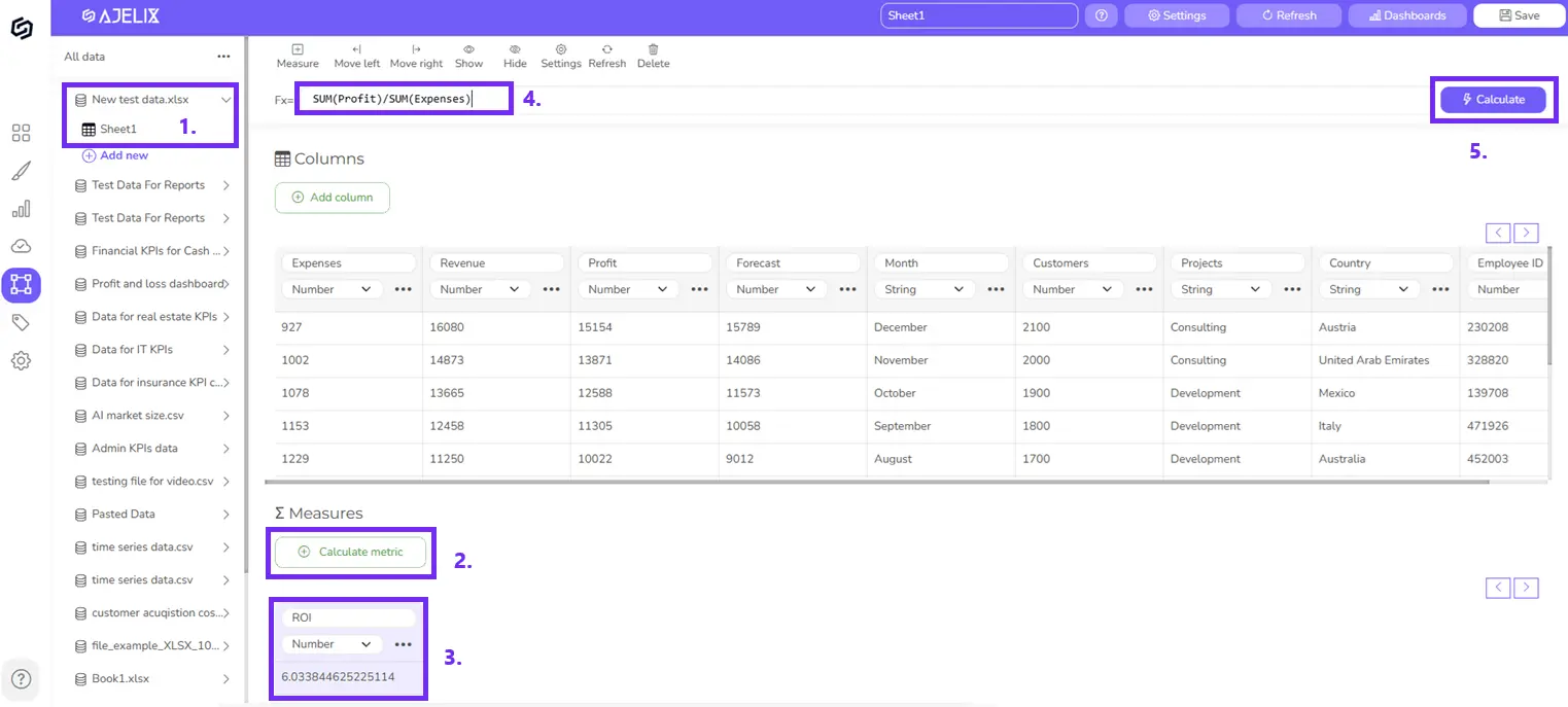
You can create as many measures as you need or add new columns to your data file and do calculations there.
4. Visualize your KPIs
Choose the visual format for each KPI (e.g., card, gauge chart, line graph). Click on data fields or drag and drop them in the visualization tool. You will find newly created metrics in your data table. If you don’t see them, sync the model by clicking the “Update” button.
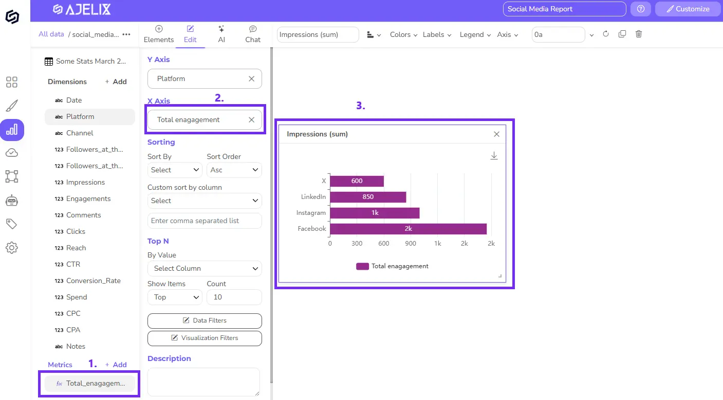
Take these steps to create visualization from your KPI (follow the steps in the picture for better understanding)
- Open the data. Under the “Metrics” tab, you will see all the calculated fields. You can also click on the “Add” button to create a metric through a quick pop-up.
- Click on the metric or drag and drop it. The system will automatically visualize it. Add another column for categories, and you will get a full chart.
- The element will automatically pop up, and you can customize it by changing data label formatting, legends, colors, and chart type.
- You can make changes in the data prep tool and sync changes in the dashboard by pressing the “Refresh” button that you can find under the small three dots on the left side editor.
If you don’t feel like visualizing, you can always use AI features. The AI dashboard generator can automatically create charts based on your data and you can customize it further.
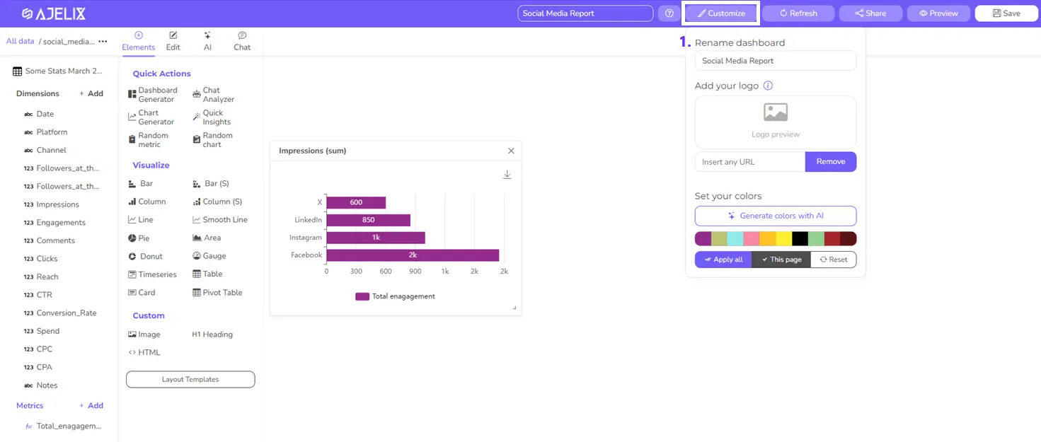
5. Customize your dashboard
Add titles and descriptions, and format the layout for clarity and visual appeal. Upload your logo and change the colors using the AI color changer under the “Customization” field.
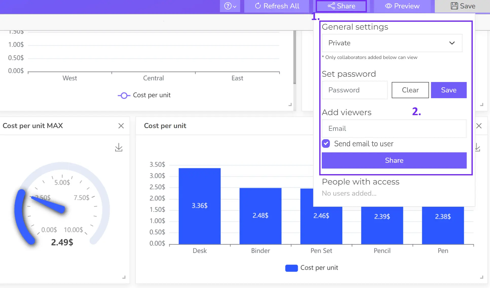
6. Share your dashboard
Once happy, publish your dashboard and share it with relevant users for real-time insights. There are several sharing options that you can read about here.
For a detailed visualization guide visit this documentation.
