Once you have uploaded data, you can start visualizing or editing your data. Usually, data modeling is done before visualizing data, however, it’s not mandatory. This guide will walk you through all the data preparation features. For visualization guides, please use this guide.
After you have uploaded data and picked Data preparation, you should have this view 👇
General Settings
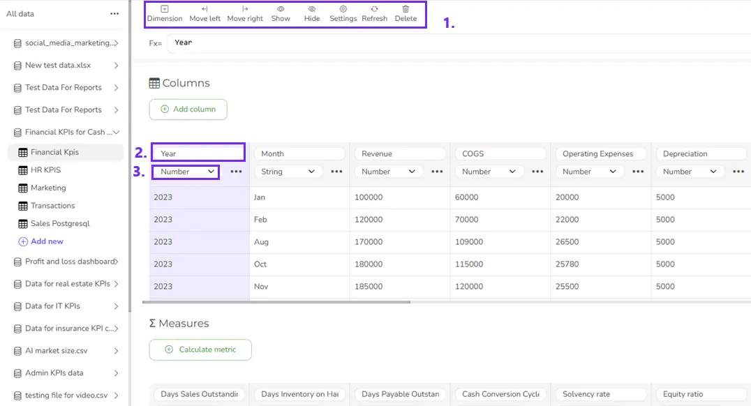
1. Start data editing by expanding the data sources from the left menu. Pick the model you want to edit, and you will see the data table preview on the right side.
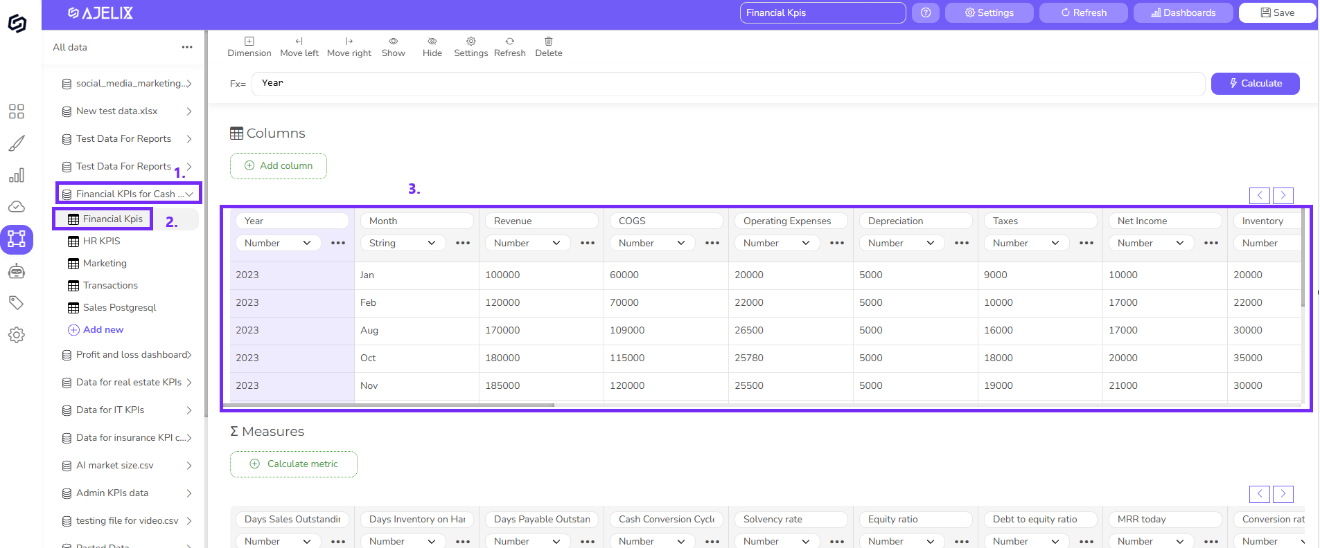
2. In the editor, you can perform several data preparation activities:
- You can delete or create new columns
- Move columns to the right or left
- Show and hide specific columns
- Rename columns
- Change data formatting to text, date, number, or true/false
Create a new column from existing data
Here are the steps:
- Click Add Column
- Give a name to your column
- Select the data formatting to Number
- Insert the formula and click calculate
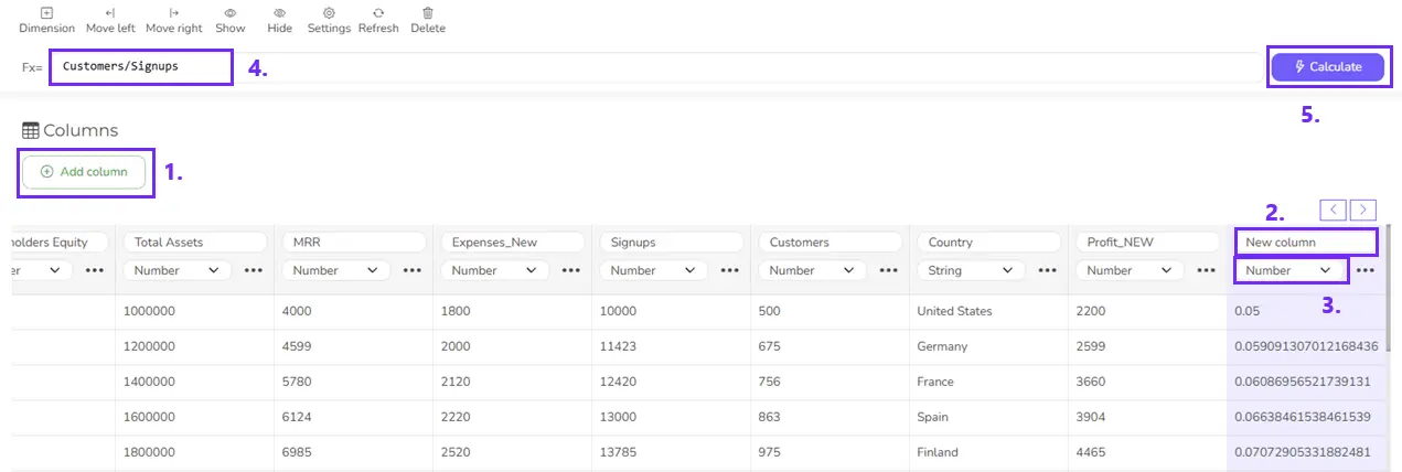
Now, you have created a new column that you can visualize.
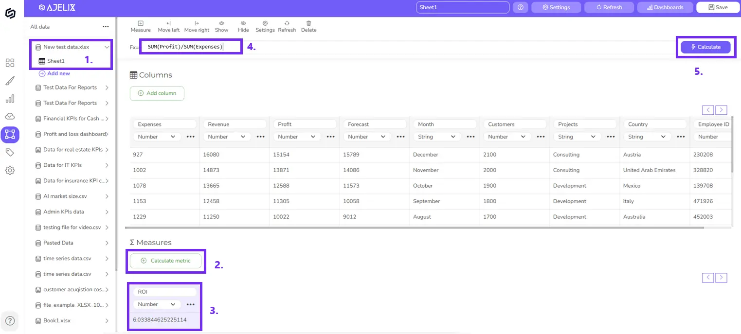
Create a measure
To create a measure from existing data, follow these steps:
- Select the data table you want to use
- Click Add measure
- Give a name to your measure and select the field formatting to Number
- Insert formula
- Click Calculate
- You will see the result in a cell
Note: You can create metrics from existing measures. Remember that metrics should be in chronological order, e.g., first, develop measures that will be used in the final calculation, not vice versa.
You can later visualize this value using the Card, Pivot Table, or Chart element.
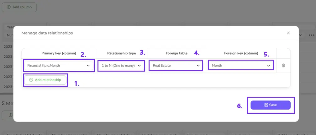
Set up data relationships
For more advanced visualizations, you can set up relationships between your data tables. It means that you will be able to create one visualization from several data sources. For example, use date as a category from data source 1 but financial data from data source 2. To do that, you need to set up relationships.
To open relationship settings, click on “Settings” at the right top menu and select “Manage data relationships”. You will see a pop-up with settings:
- Click Add Relationship
- Select the column you want to connect
- Set relationship type:
- 1 to N (one to many)
- N to 1 (many to one)
- 1 to 1 (one to one)
- Add the foreign table that you want to connect
- Select the column you want to match from the external data source
- Click Save
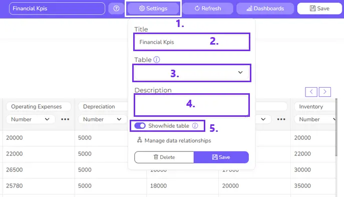
Change the data source settings
You can also change settings for your data source, such as renaming the file, adding a description, and marking it as public or private.
Building dashboard
Once you have edited the data, you can start visualization. When you open the dashboard editor you can see all data sources on the left side. Expand any data source and click on any column to create a chart.
For more guides on how to visualize data please visit this guide.
It’s important to note that once you have built charts from the data model don’t rename the columns, as you can experience some inaccuracies.
