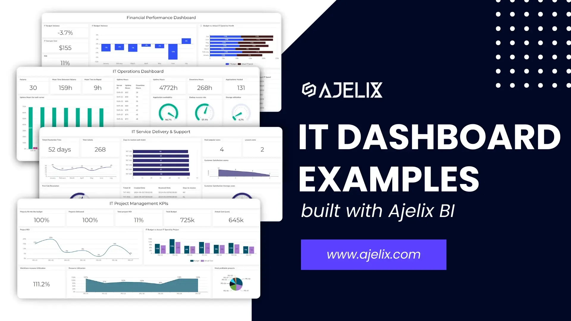
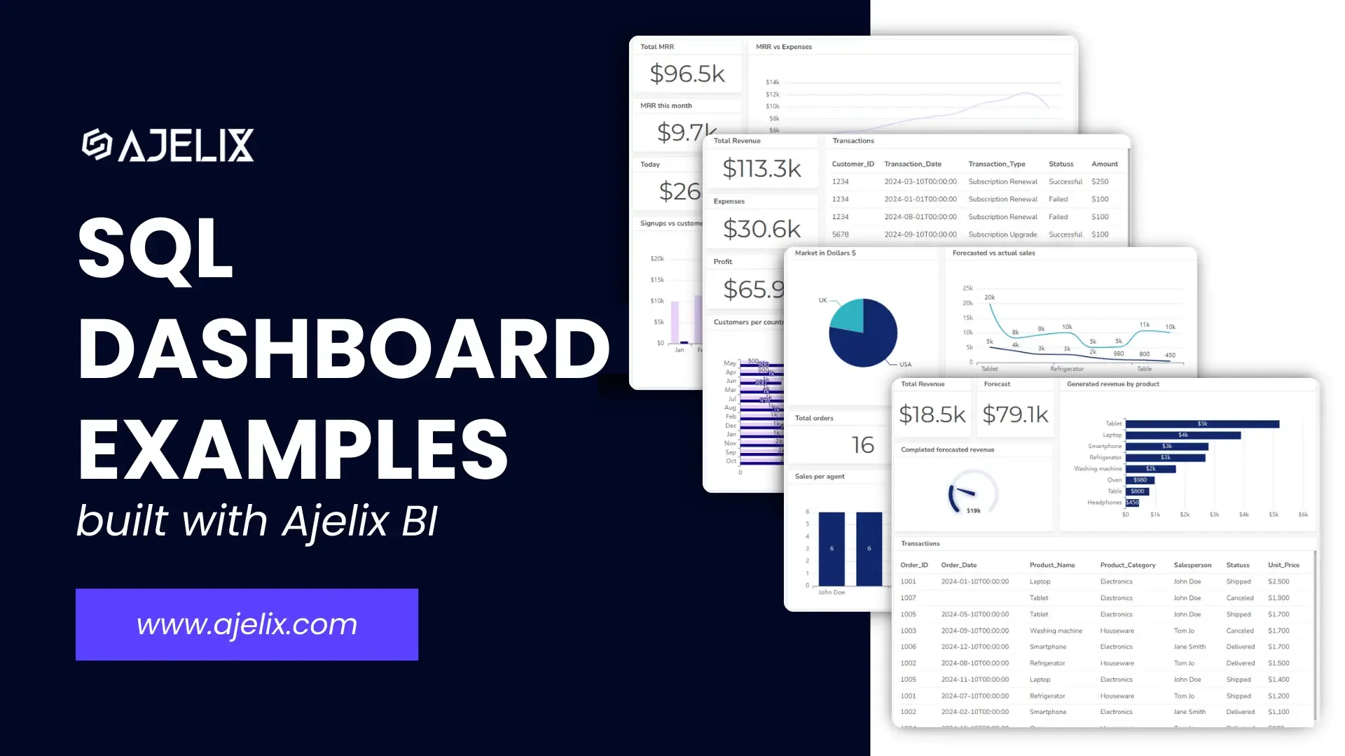
IT Dashboard Examples For IT Department Managers
IT dashboards have become indispensable tools for organizations seeking to make informed decisions and optimize IT departments.
With the ability to visualize complex data in real-time, dashboards provide a clear and concise overview of key performance indicators (KPIs), to identify trends, detect anomalies, and proactively address potential issues.
This article will showcase IT dashboards, exploring various types and showcasing IT key performance indicators (KPIs) that can be tracked. Whether you’re an IT professional looking to enhance your reporting capabilities or a business leader seeking insights into your organization’s IT infrastructure, this guide will provide valuable information.
Change the way you work with agentic AI
One-click dashboards,KPI tracking, and AI-powered insights—for work that actually gets done.

What is an IT dashboard?
An IT dashboard is a visual tool that provides a real-time overview of key performance indicators (KPIs) related to an organization’s IT infrastructure. It typically displays data in a graphical format, such as charts, graphs, and tables, making it easy to understand and interpret. When assessing tools for IT operations or secure document management, performing a virtual data room price comparison can ensure cost-effective decisions without compromising on features.
Think of it as a cockpit for your IT operations. It helps you monitor and manage various aspects of your IT environment, including:
- Network performance: Bandwidth usage, latency, and packet loss
- Server health: CPU utilization, memory usage, and disk space
- Application performance: Response times, error rates, and uptime
- Security: Threat detection, vulnerability assessments, and compliance
- User experience: Login attempts, help desk tickets and customer satisfaction
5 types of IT dashboards
- Service Delivery and Support Dashboard
- Operations Dashboard
- Project Management Dashboard
- Financial Performance Dashboard
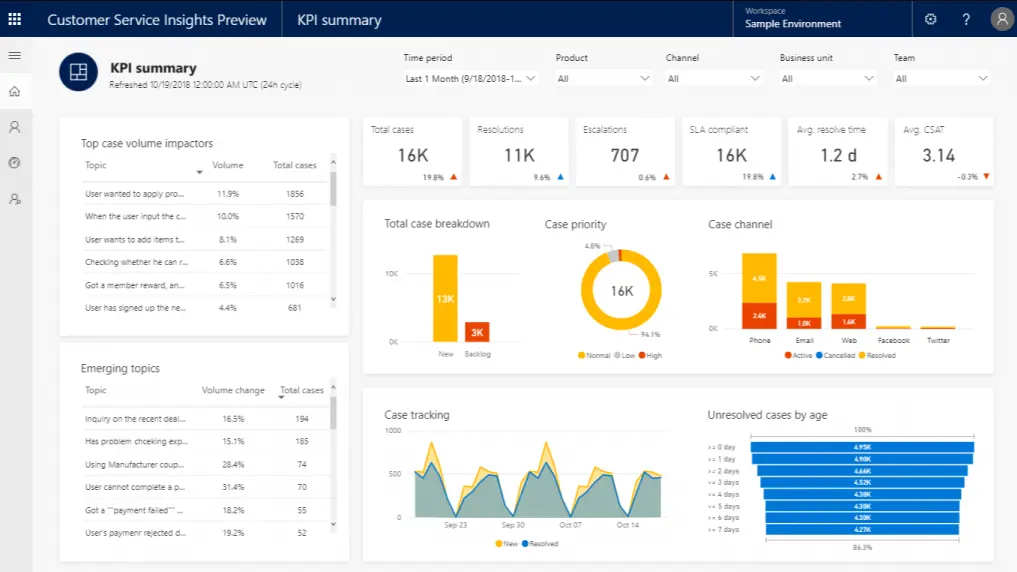
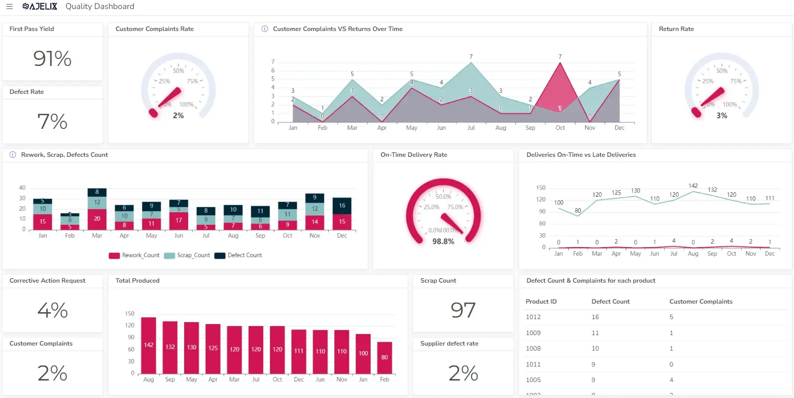
1. IT Service Delivery and Support Dashboard
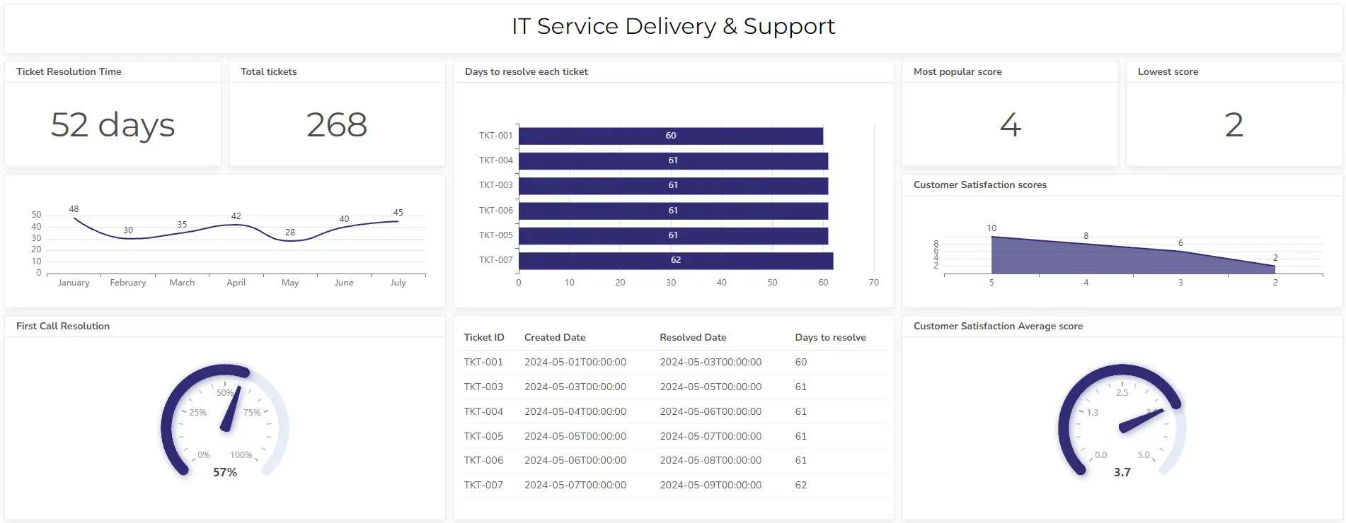
The primary goal of this dashboard is to monitor and improve the quality and efficiency of IT services delivered to end-users. This dashboard includes metrics measuring IT ticket resolution, customer satisfaction, and other KPIs.
KPIs & Metrics
In the dashboard example above are visualized metrics that can help IT support team leads track the team’s performance. These metrics include:
- Incident resolution time: Average time taken to resolve IT incidents (e.g., tickets, outages).
- Customer satisfaction: User satisfaction ratings for IT services.
- Help desk ticket volume: Number of support tickets received and resolved.
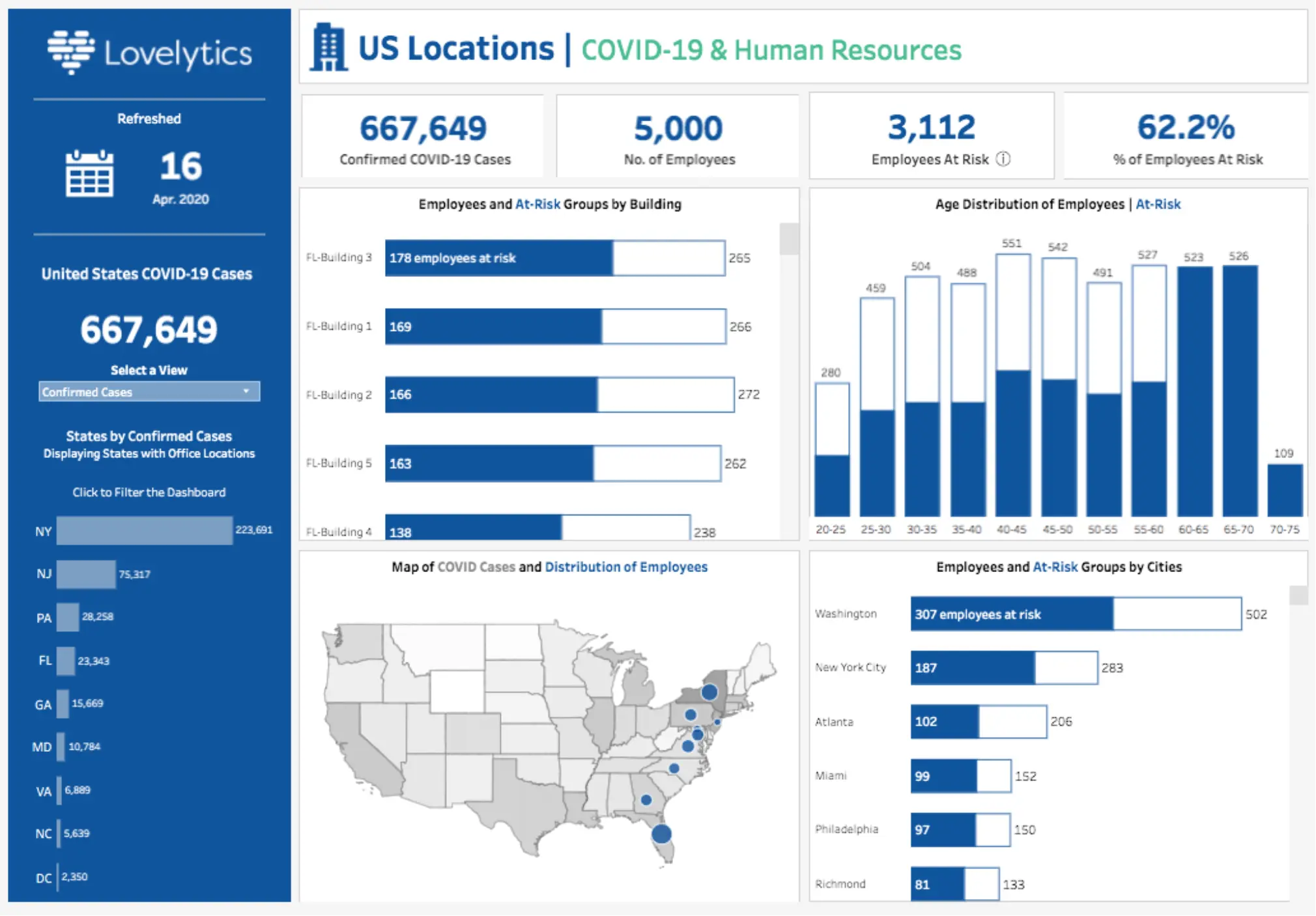
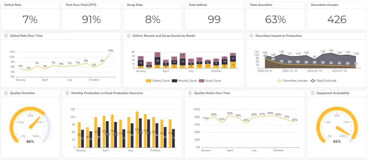
2. IT Operations Dashboard
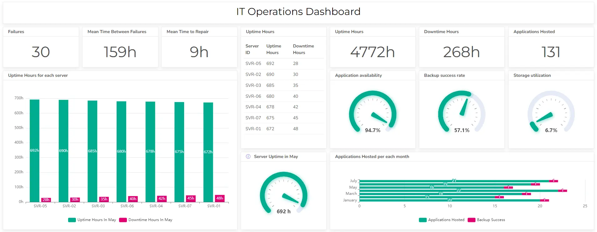
This dashboard monitors the performance and health of IT infrastructure components, such as application and server uptime.
KPIs & Metrics included
In the operational IT dashboard, you can see these metrics visualized:
- Server uptime: Percentage of time servers are operational.
- Downtime: Hours when the server and application were down
- Backup: Information about backup process completion
- Network utilization: Bandwidth usage, latency, and packet loss.
- Storage utilization: Disk space usage and performance.
- Application performance: Response times, error rates, and uptime.
Struggling with manual calculations & tiring setups?
Let agentic AI do the heavy lifting.
Start free
Fast sign up & easy setup
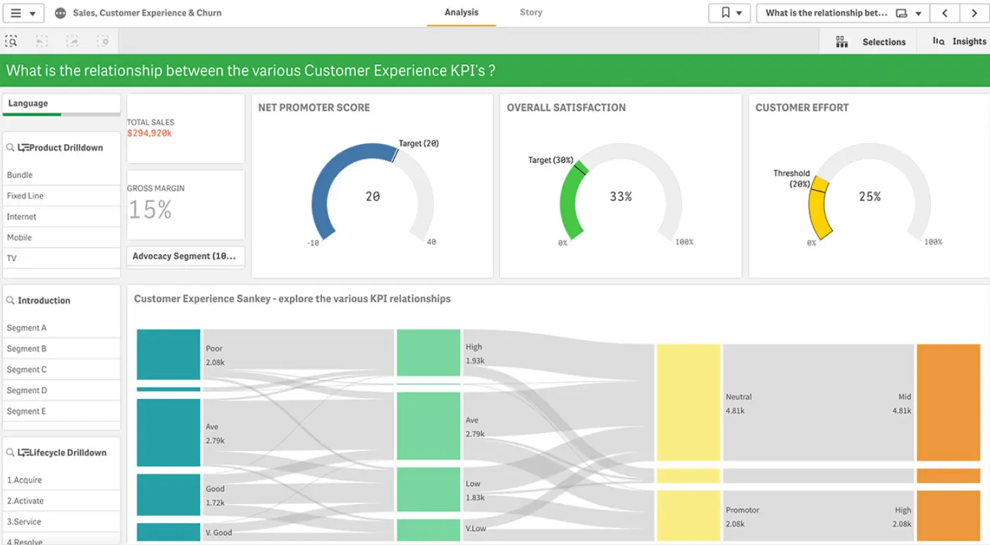
3. IT Project Management Dashboard
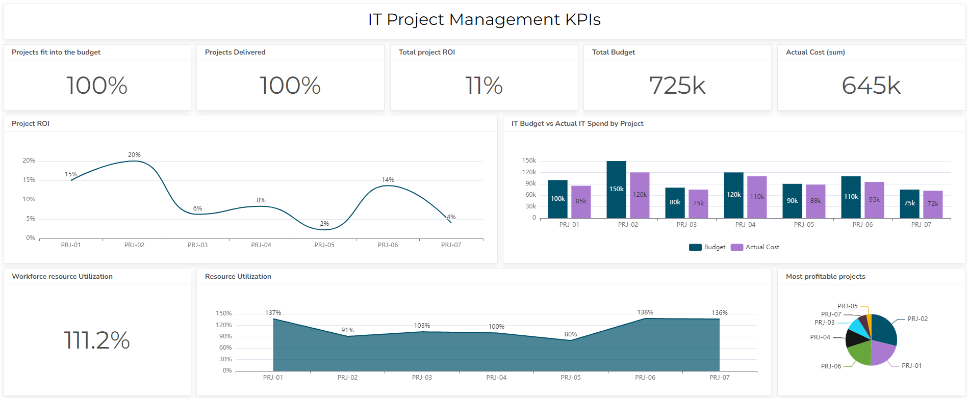
This dashboard tracks project progress to identify delays, measure progress, and ensure successful project completion.
KPIs & Metrics included
This dashboard visualizes metrics that help IT team leads measure project success, here are the main KPIs:
- Project schedule adherence: Percentage of project tasks completed on time.
- Project ROI: The return on project investment.
- Workforce resource utilization: Percentage to understand employee utilization.
- Project budget adherence: Percentage of project budget spent.
- Project scope adherence: Percentage of project scope changes.
- Risk assessment: Identification and mitigation of project risks.
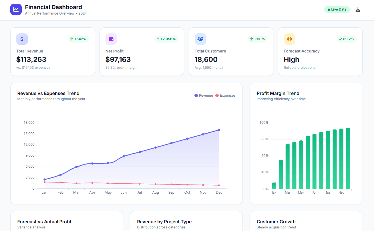
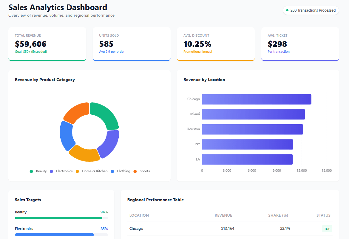
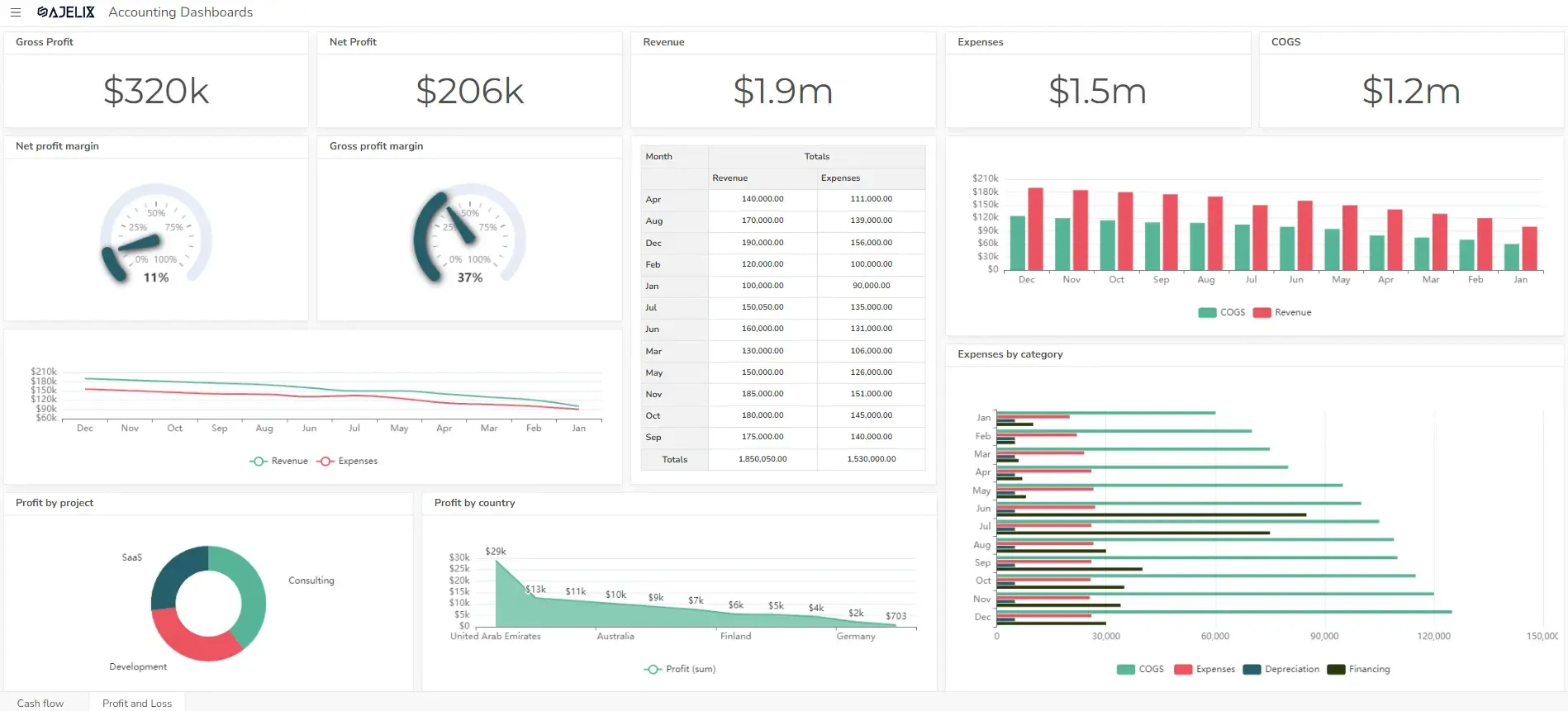
4. IT Financial Performance Dashboard
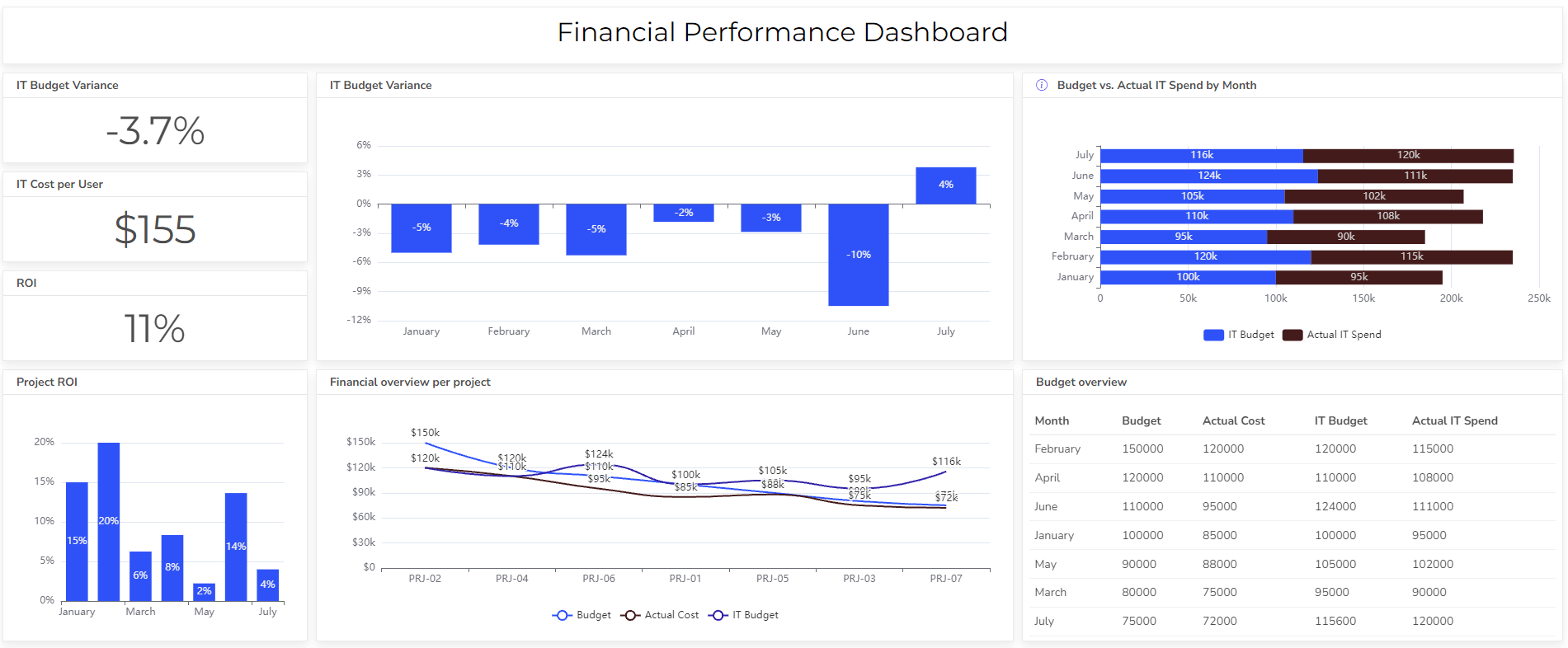
This digital dashboard monitors IT spending, revenue, and return on investment (ROI). The primary goal is to help team leads assess the budget spending and fit into it.
KPIs & Metrics included
In the example above there are several metrics visualized to assess the IT department’s financial performance:
- IT spending as a percentage of total revenue: Cost of IT as a proportion of total business revenue.
- IT budget variance: The difference between the actual IT spending and the budgeted amount
- IT cost per user: Cost of IT services per end-user.
- IT ROI: Return on investment from IT projects and initiatives.
- IT asset utilization: Efficiency of IT asset usage.
Top IT Dashboard Tools
Here are some popular IT dashboard tools that offer robust features for visualizing and analyzing IT data:
1. Ajelix
Easy-to-use business intelligence tool that offers a user-friendly interface and extensive customization options. Ajelix BI is well-suited for building IT dashboards.
Reporting gives you a headache?
Upload your data and create professional reports with agentic AI
Start free
Try free and upgrade whenever
2. Tableau
A leading commercial BI tool is known for its ease of use and powerful visualization capabilities. Tableau offers a variety of connectors for integrating with different data sources. You can also view article about tableau pros and cons.
3. Power BI
Microsoft’s cloud-based BI service provides a rich set of features for creating interactive dashboards. Power BI integrates seamlessly with other Microsoft products.
4. Qlik Sense
A self-service BI tool that uses associative data analysis to provide insights into complex data sets. Qlik Sense offers a unique approach to data exploration and visualization.
5. Sisense
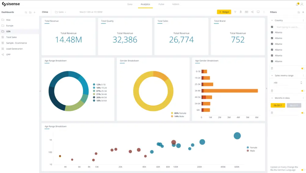
A cloud-based BI platform that specializes in real-time analytics and embedded analytics. Sisense offers a variety of pre-built dashboards and templates for IT use cases.
Conclusion
As the IT industry continues to evolve, the importance of effective IT management will only grow. By investing in robust IT dashboards, IT department managers can equip themselves with the tools necessary to drive innovation, optimize operations, and deliver exceptional value to their organizations.
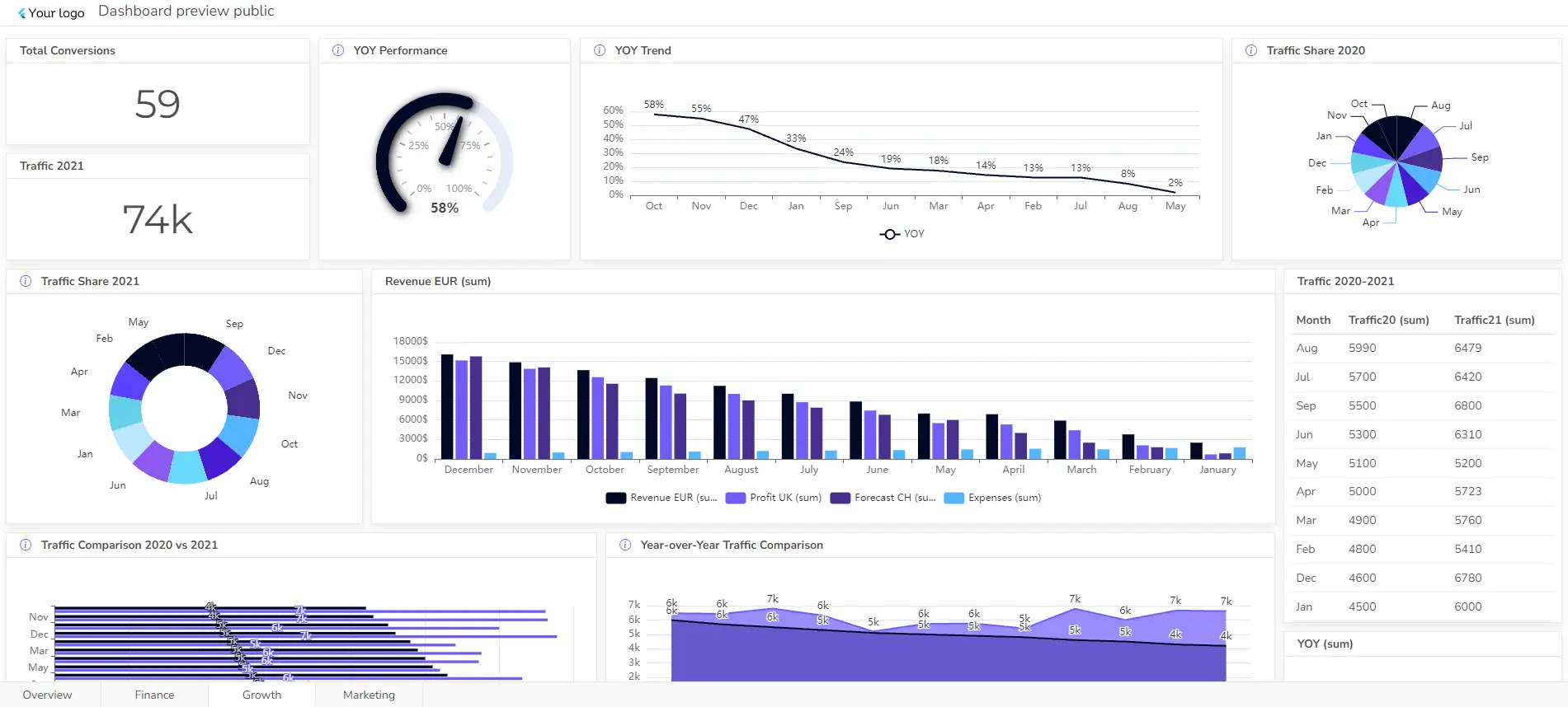
Explore other dashboards


Ready to create your dashboard?