What Is a Pivot Chart? How To Create & Use In Excel

Using Pivot Charts in Excel is a straightforward and effective method to visualize data and organize complex datasets. These charts enable you to compare data quickly, spot trends, and emphasize key information. In this blog, we’ll guide you on how to utilize pivot charts in Excel and the steps to create them.
What Is a Pivot Chart?
A pivot chart is a chart that derives its data from a pivot table. It visually represents data in your spreadsheet, helping you grasp the relationships between various data points. This tool provides a quick overview of your data and aids in identifying trends.
Pivot charts are very versatile. You can customize them to show different data points, and you can also use them to compare different data sets. They’re a great way to make your data visualization and quickly identify trends in your data.
Benefits of Using Pivot Chart in Excel
- Quickly spot trends: pivot charts help you easily identify trends in your data by visually showcasing relationships among different data categories.
- Easily compare data: create quick comparisons across categories, making it easier to spot patterns or anomalies.
- Create complex charts: build intricate charts that would be challenging to produce otherwise.
- Analyze data: facilitate quicker and more accurate data analysis compared to manual sorting and filtering.
- Easily change data: modify the data being analyzed by dragging and dropping different categories into the chart.
- Add interactivity: add interactive elements, making your charts more engaging and easier to interpret.
Related Article: How To Delete A Chart in Excel?
How to Create a Pivot Chart in Excel
Time needed: 4 minutes
Here’s How To Create A Pivot Chart in Excel
- Select the Data
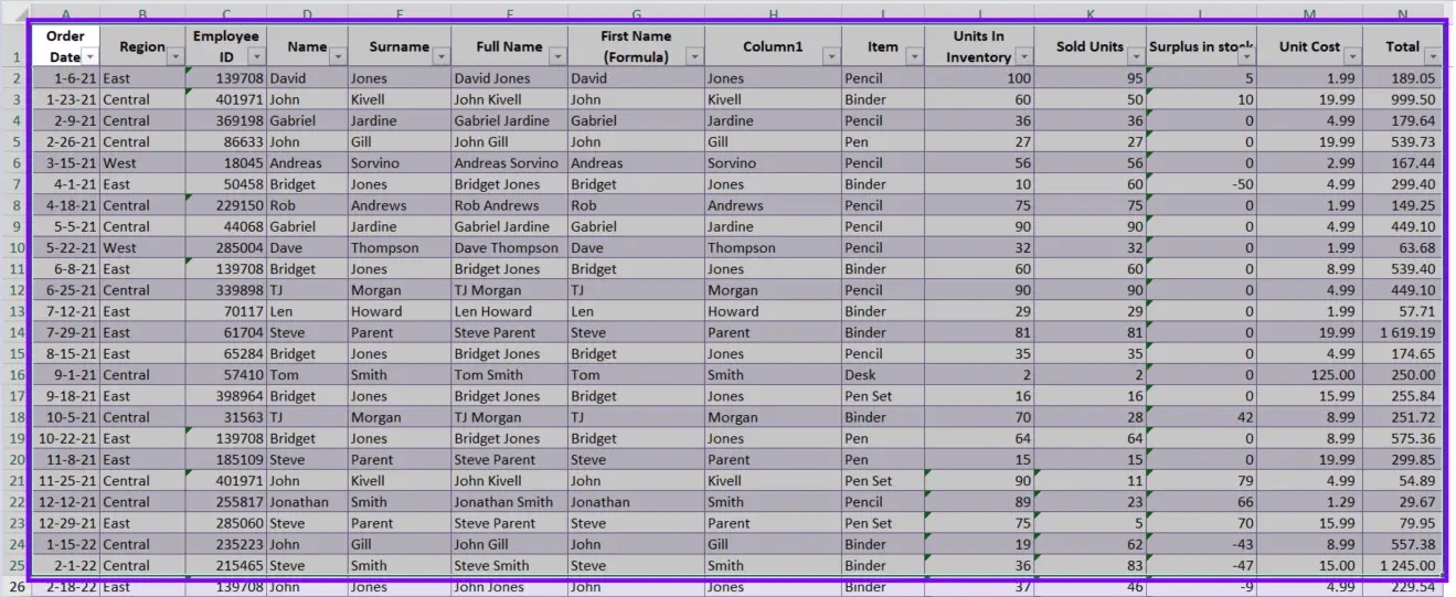
Select the data you want to include in the pivot chart.
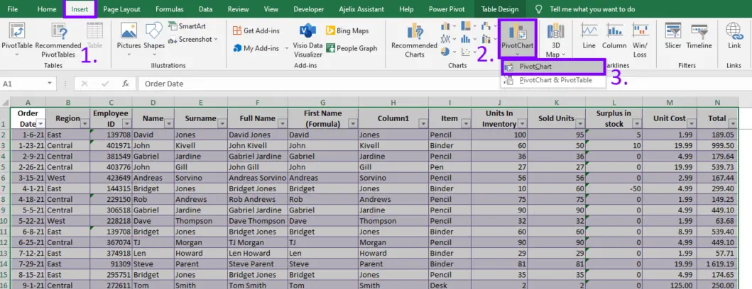
- Insert Pivot Chart
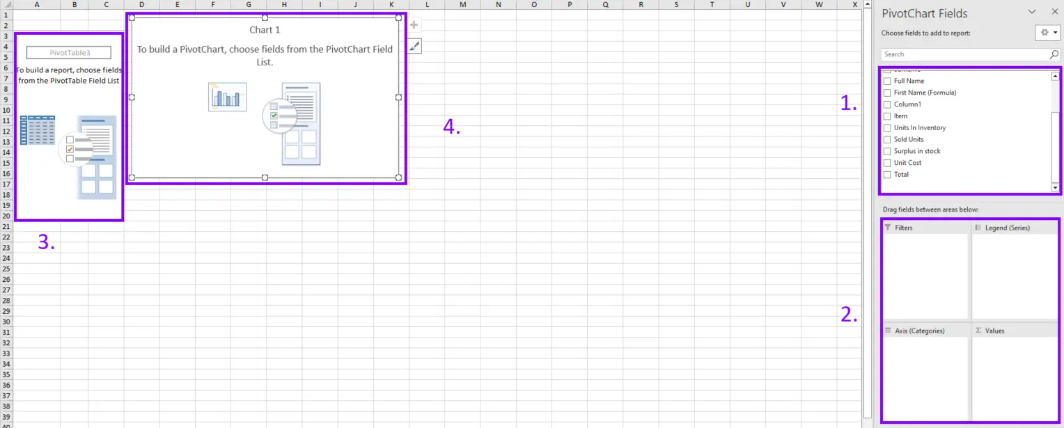
Go to the Insert tab, then select Pivot Chart.
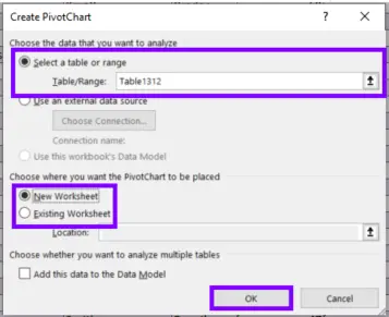
- Adjust settings in the pop-up window
Change the settings in the window. Select the data you want to include in the pivot chart and select the exact location of the graph. Press OK.
- Create a Pivot Table with Pivot Chart
You can choose the data that you want to include in the pivot table and chart. Pivot chat will automatically build your chart.
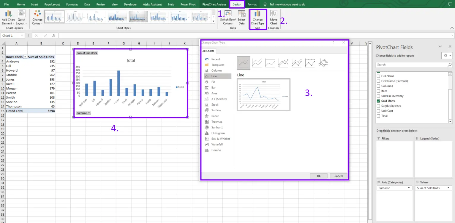
- Customize Chart
Now you can change the chart layout, and design by adding different data points, labels, and other elements. You change the pivot chart type by following the guides in the picture below.
More on How To Create a Pivot Table in Excel?
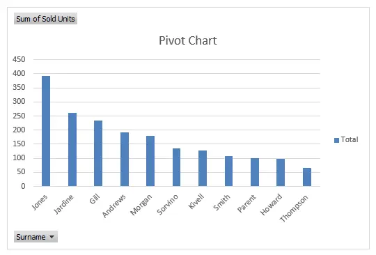
Using Pivot Charts
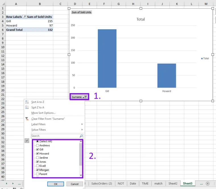
Once you’ve whipped up a pivot chart, you’ll find it’s a fantastic tool for quickly comparing and analyzing your data. You can easily customize it to display various data points and shine a light on different trends that might be hiding in your numbers. One of the best features of Pivot Charts is that you can filter data directly within the chart itself, super handy!
If you’re looking to compare data across different datasets, pivot charts have got you covered. For instance, you could use one to compare sales figures from various stores or track performance across different regions.
It’s all about making your data work for you! Check out the picture above for more helpful guides.
Related Article: How To Create a Sparkline in Excel?
Tips for Using Pivot Charts
Here are some tips for using pivot charts in Excel:
- Start with a simple chart. Don’t try to add too much data or customize it too much in the beginning.
- Use the right chart type. Different types of charts are better suited for different types of data. Creating Charts and Graphs in Excel.
- Keep it simple. Don’t try to add too much data or too many elements to the chart.
- Use labels. Labels can help you quickly identify data points and understand trends in your data.
- Use filters. Filters can help you quickly identify and analyze important data points. How To Use Filters in Excel?
- Use color. Color can help you quickly identify data points and trends in your data. How To Remove Conditional Formatting?
Related Article: Say Goodbye to Manual Work. How To Automate Tasks in Excel
Conclusion
In a nutshell, pivot charts in Excel are a fantastic tool for visualizing data effortlessly and making sense of those complex data sets. They give you a quick snapshot of your information and help you spot trends in no time.
With just a few simple steps, you can create your own pivot charts and start comparing and analyzing your data like a pro. So why not give it a try? You’ll be amazed at how much easier it makes your data journey!
Frequently Asked Questions
The types of charts you can use in a pivot chart in Excel include column charts, bar charts, line charts, pie charts, area charts, scatter charts, and more.
Yes, it is possible to filter data in a pivot chart in Excel. You can apply filters to specific data fields to focus on specific information within the chart.
The main difference between a pivot table and a pivot chart in Excel is their visual representation. A pivot table displays summarized data in a tabular format, while a pivot chart represents the same data visually using different chart types.
Learn more productivity tips in our other articles. Let’s connect and receive more daily tips and updates.
Speed up your spreadsheet tasks with Ajelix AI in Excel


