Creating Charts In Excel with Agentic AI – It Does Everything!

You can now create professional Excel charts, KPI dashboards, and interactive visualizations in under 10 minutes without touching a formula or a formatting menu. Agentic AI tools handle the entire workflow: analyzing your data, choosing the right chart types, building interactive Excel formulas, and delivering a polished, print-ready spreadsheet. What used to take hours of manual work now takes a single prompt.
This is a step-by-step guide based on a real workflow demo. You’ll see exactly how an AI agent turns raw sales data into a fully formatted Excel dashboard complete with revenue charts, KPIs, and interactive filters. The full video is embedded below so you can follow along visually.
Why AI Is Now the Fastest Excel Chart Generator
If you’ve ever been asked for a sales performance update by end of day, you know the pressure. You have the data, but building charts, writing formulas, and formatting a professional dashboard in Excel takes hours. That’s exactly the problem agentic AI solves.
Unlike a simple AI chatbot that explains how to create a chart in Excel, an AI agent actually creates the file for you. It plans the analysis, writes the code, fixes its own errors, and delivers a downloadable .xlsx file all through a chat interface. This is the difference between chat mode (fast but shallow) and agent mode (slower but genuinely capable of complex, multi-step work).
How to Create Charts in Excel Using an AI Agent: Step-by-Step
1. Choose the Right Tool and Model
For this workflow, we use chat.ajelix.com, which offers a free tier so you can try before subscribing. The tool supports both chat mode and agent mode.
Always choose agent mode for complex Excel work. Agent mode allows the AI to plan, reason, self-correct, and execute a multi-step workflow, which is exactly what creating charts in Excel requires. Chat mode is faster but won’t produce the same depth or quality.
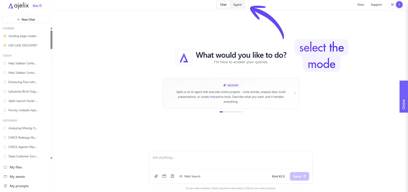
Equally important: select a larger, more intelligent model. A smaller model will produce average results. For professional output, the kind you’d send to a client or your boss, the bigger model’s reasoning capability makes a measurable difference in the final Excel file.
2. Write a Focused Prompt
Before uploading anything, write a detailed prompt that tells the AI exactly what to build. This is the prompt we used in the video to achieve amazing results:
Analyze the provided data and create a comprehensive analysis directly within the Excel spreadsheet, including clear metrics, KPIs, and professional charts. All charts should be visually polished, easy to interpret, and use the accent color [your-color] consistently. Make the charts fully interactive (filters, slicers, or dynamic ranges) and include a dedicated summary dashboard sheet where all key data and insights are visualized in a clean, executive-friendly layout that is easy for leadership to understand at a glance.
The more specific you are about chart types, colors, and layout, the closer the output will match what you need. You don’t need to list every type of chart in Excel you want, the agent will choose appropriate visualizations based on your data structure.
3. Upload Your Data File
Upload your sales data file (CSV or Excel). The demo uses a basic file with revenue figures, product categories, and location data, nothing exotic. The agent handles messy, real-world data structures well.
4. Send and Wait (It’s Worth It)
This is not instant. Expect the agent to take 5 to 10 minutes for a task like this. For more complex workflows, research plus a PowerPoint presentation (we did a video on this), for example, can run 10 to 15 minutes or longer. The agent in this demo completed 22 actions to deliver the final file, including hitting an error and self-correcting without any input from the user.
That self-correction capability is what separates agent mode from a simple Excel AI chart generator. It doesn’t just attempt the task, it validates its own work and iterates until the output is correct.
What the AI Actually Built
Here’s what the agent produced from a basic sales data file with one prompt:
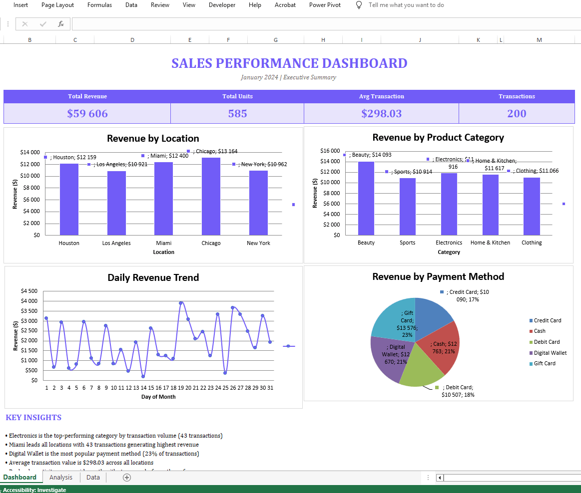
Sales Performance Dashboard (dedicated sheet) The dashboard used the requested brand color throughout and included multiple chart types:
- A revenue by location bar chart with data labels
- A revenue by product category chart
- A daily revenue trend line chart showing performance over time
- A pie chart for category breakdown
- Quick filters for interactive data slicing
- Key insights section with auto-calculated totals
- Interactive KPI formulas that update dynamically
- A formatted data table with cleaner styling than the source file
Download the Excel file the AI agent generated to check it out
Every metric in the dashboard is formula-driven, not hardcoded, which means the file stays useful and updatable. This is the practical difference between an AI that generates a screenshot of a chart and one that builds a working, live Excel file.
What This Would Have Cost in Manual Time
If you were creating charts in Excel by hand, choosing chart types, formatting axes, writing KPI formulas, arranging layout, and applying consistent colors, this dashboard would take a couple of hours minimum for an experienced Excel user. For someone less familiar with Excel’s chart builder and formatting tools, it could take half a day.
The AI agent completed an equivalent (and arguably more consistent) result in approximately 8 minutes.
Other Use Cases: What Else AI Agents Can Build in Excel
The same workflow extends well beyond sales dashboards. In the video, we covered several other use cases that are possible with Ajelix agentic AI:
- Invoice templates – fully dynamic, formula-driven, print-ready (View full video)
- Financial dashboards – revenue trend analysis, forecasts, location and product category breakdowns, payment method analysis, all in one file (Read the guide or watch video where we created dashboards)
- Financial models, expense trackers with what-if analysis – scenario modeling, benchmarks, and sensitivity tables that would take days to build manually (Full video)
In every case, the approach is the same: one prompt, one data file, one agent run.
Tips for Getting the Best Results
- Use agent mode, not chat mode. For any Excel task involving charts, formulas, or multi-sheet work, agent mode is non-negotiable. Chat mode simply doesn’t have the depth to complete complex workflows reliably.
- Pick the biggest model available. The quality gap between a small and a large model is significant for spreadsheet work. If the tool lets you choose, always go larger for AI for Excel charts.
- Be specific in your prompt. Mention the color palette, the chart types you want (bar, line, pie, etc.), whether you want a separate dashboard sheet, and any KPIs that matter to you.
- Save or download immediately. Don’t rely on the tool storing your file. Download it as soon as it’s ready.
- Expect imperfection on the first run. The agent may slightly misalign charts or leave a section incomplete. This is normal and easy to fix manually or by reiterating with another prompt because the heavy lifting is already done.
Frequently Asked Questions
Tools like Ajelix (chat.ajelix.com) let you upload a data file and use an AI agent to generate charts, dashboards, and KPI tables directly inside a .xlsx file, no manual chart-building required.
In a single run, AI agents can produce bar charts, line charts, pie charts, and combination charts, selecting the most appropriate visualization for each dataset automatically.
Excel’s native AI features assist with suggestions inside the app. An external AI agent like this operates independently: it writes the actual Excel file from scratch, performs web research, applies formatting, builds formulas, and delivers a finished product.
Yes. If your data suits a scatter or XY graph, you can specify this in your prompt and the agent will create it. You can also let the agent decide which chart type fits your data best.
Ajelix offers a free tier, which lets you test the workflow before committing to a subscription. This is a good way to evaluate the output quality with your own data.
Summary
Creating charts in Excel no longer requires hours of manual formatting. With an agentic AI tool, one prompt and one data upload produce a professional, interactive dashboard with multiple chart types, live formulas, and a clean design in under 10 minutes. The key is using agent mode, selecting the most capable model available, and writing a clear, specific prompt.
If you’re regularly building Excel reports for clients or internal teams, this is the workflow change that saves the most time.
Want to create your own Excel dashboard? Sign up for free on chat.ajelix.com and save hours. View more AI agent workflows like this on Ajelix YouTube channel for real-world use cases across Excel, PowerPoint, dashboards, and more.
Agentic AI chat that helps you complete projects
AI for work that ingests, transforms, and delivers the exact deliverables your team needs, while you stay focused on strategy. No more chatting, agents can get the job done.